Tuesday, March 07, 2006
Duality

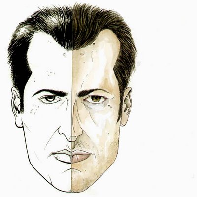
"Duality"
October 2005
When we were working on a website for my artwork this image was supposed to be the at the center of the home page. As it turns out I was a bit uncomfortable about using my face as the first thing you'll see when going to marcodileonardo.com
The basic idea here is that there are two parts to the web site. The comic book art section which is black and white, and the abstract paintings section which would feature the painted side on the right.
We scrapped the idea because I hate showing people just how vain I truly am. Also because this piece is ugly a shit.
Comments:
<< Home
You know i've been weighing the pros and cons on wheather or not to use this one on the site. I actually created a whole new design for the homepage. The new one has the Twins on the left and some abstract stuff on the right.
Still not sure which to use just yet.
Thank you for your opinion Sal.
Post a Comment
Still not sure which to use just yet.
Thank you for your opinion Sal.
<< Home


